Vithos
A lab report gives you a number and a range. The question people have is whether it is better or worse than last time, and last time is in a different PDF from a different lab.
- Founding Product Designer (team of 3)
- 2026
- Consumer health · family records
- In beta, mobile app unreleased
01Context
Vithos is built by three people: two technical co-founders who write the product, and me as founding product designer. I designed the mobile app, the website, and the flows through both, and I ran critique and testing on the mobile side throughout.
02The problem
Families end up managing health for more than one person, a parent's checkup alongside your own. The record of it is a folder of PDFs from whichever lab was nearest at the time.
A single report gives you a value and a reference range. The question people actually have is whether it is better or worse than last time, and last time is in another file, from another lab, formatted differently.
Fixing that requires every report, for everyone in the family. It is a high-friction ask: handing over a parent's blood work to an app found last week.
So the product needs the records to be useful, and has to be trusted before it is given them. Every decision below sits on one side of that trade or the other.
03How it works
A report goes in as a file or a photograph taken on a phone. Most arrive as photographs, because the report is handed over on paper. The biomarkers are pulled out, attached to the right person in the family, and placed on a timeline with everything else that person has ever had measured. From there the history can be read, or asked questions against.
04What I decided, and why
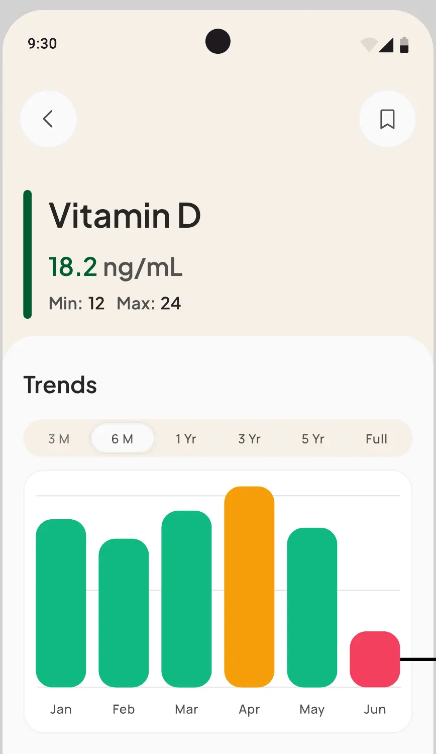
Graphs before numbers. A full panel is dozens of values. Set as a table, the reader compares every row themselves and gives up around the eighth. A chart does the comparison: the shape reads as better or worse before any figure is. The numbers stay one step away for anyone who wants them.
Rejected The panel as a table, which is what every lab report already is.
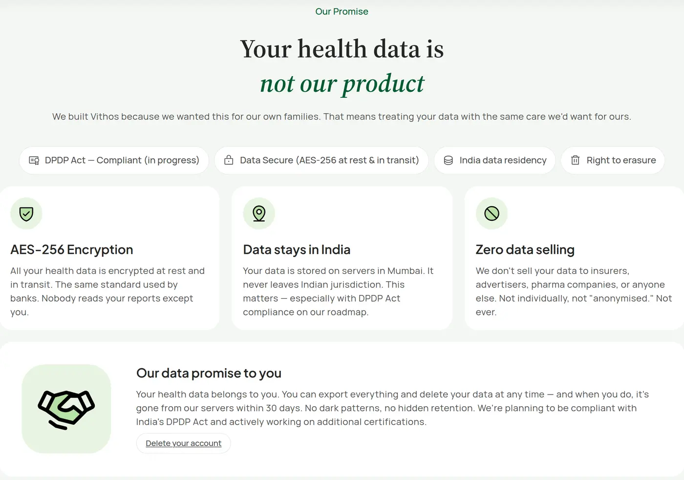
Say what happens to the data where the data is asked for. “Your health data is not our product” does nothing in a privacy policy, which is read long before or long after the upload. It belongs beside the upload control.
Rejected A link to the privacy policy.
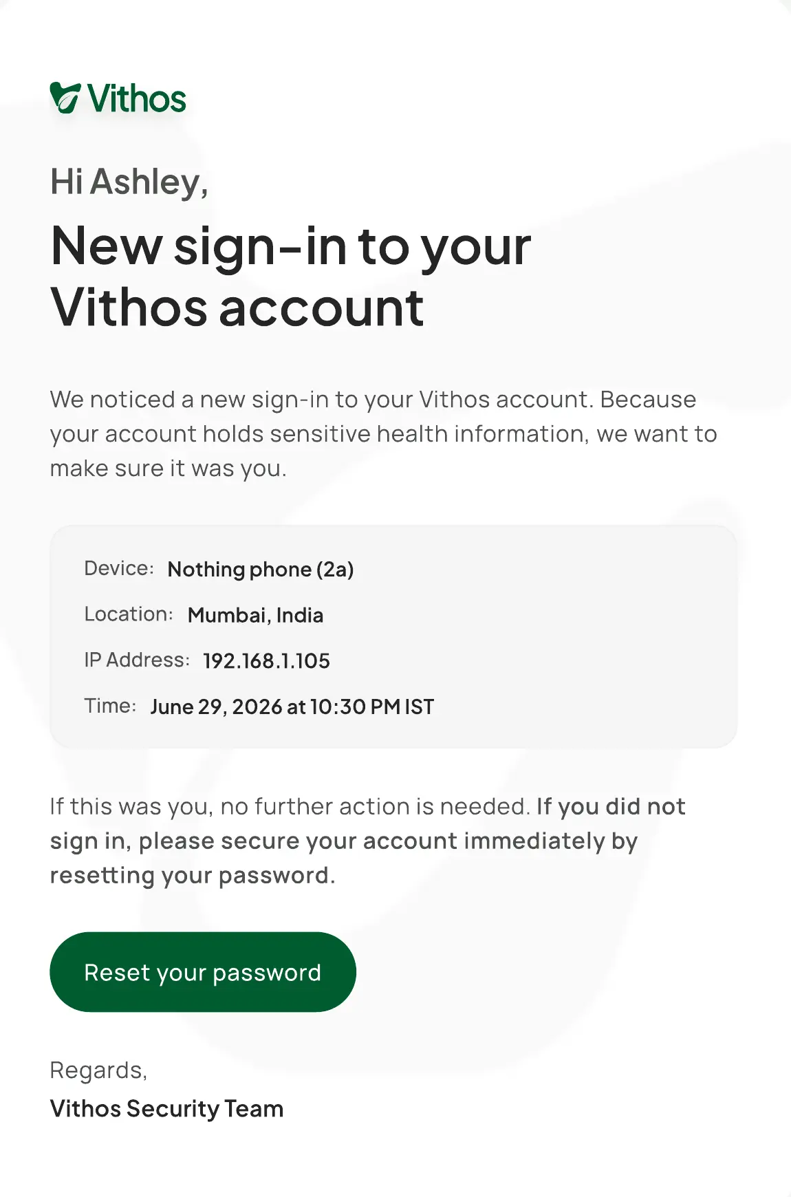
The account says when it has been opened. A family account holds several people's medical records, and the person most likely to open it after you is someone in the family. Access notification is therefore a product feature, and several decisions in the sign-in flow follow from that.
Rejected Treating access as a security setting.
Interface quality is part of the trust argument. This is the one I had to defend most, because it sounds like polish for its own sake. In consumer health, software that looks careless reads as careless with the data behind it. That is where the effort went.
Rejected Shipping rough and polishing after beta.
05How it got tested
Several rounds across every flow, weighted to mobile, where the product is actually used. The realistic moment is someone photographing a report in a clinic waiting room. I ran the critique and testing on that side myself.
The landing page is recent and had a review of its own, aimed at whether the message lands. For a product that opens by asking for medical records, it carries the trust argument before anyone has seen a screen of the app.
06Where it is
In beta. The mobile app has 14+ testers and has not been released yet; the web app has about ten. Extraction has been near-perfect so far, measured by comparing the extracted biomarkers against the source reports.
- 14+ mobile beta testers
- ~10 on web, both in beta
- Extraction checked against source